12th November 2010


v37

~ Design & Technology ~
Designers and Designing
Designers and Designing
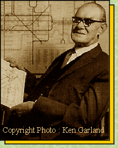

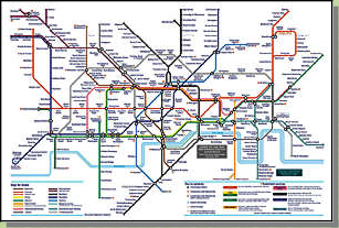
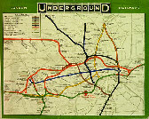
Harry Beck has a significant design status having designed the London Underground Map. The map was the forerunner of the now common approach to graphically presenting the distance on maps rather than showing it in a relative way as had previously always been the expectation. After all the critics would argue - a map was a map wasn't it !? Some confusion is created only if it is believed that the angle of a line on the map really does suggest that a different 'compass' direction is being taken by the route .... But then after all people on the Underground are - as the name suggests - under ground and therefore have no points of reference. So why worry if were you want to go to is where you eventually end up!
Beck's idea has been copied throught the world by airlines, train maps,
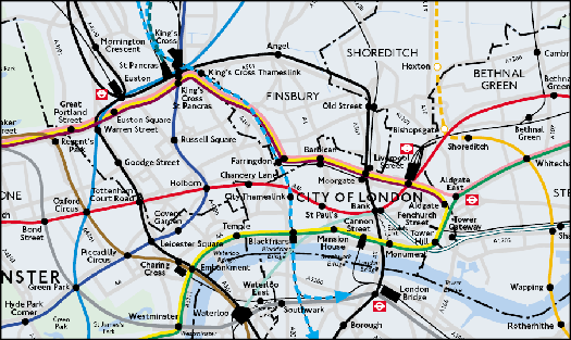
bus guides,city plans and almsot everything that uses the map more as guide than a n absolute represntation of reality. Is it really important to know what slight changes in direction the line took between Morden and High Barnet on the London Underground map? As long as the information about the stations in-between and the connections with other lines are included –
surely it really doesn’t matter too much.
bus guides,city plans and almsot everything that uses the map more as guide than a n absolute represntation of reality. Is it really important to know what slight changes in direction the line took between Morden and High Barnet on the London Underground map? As long as the information about the stations in-
© London Underground ~ Transport for London
Beck's employers were not as innovative in their thinking as Beck himself and initially rejected the idea, only to print a trial run to give away free. The public showed confidence in the idea since the maps went very rapidly out of stock. The map had to be reprinted and has become afeature not only of the London scene but of the World's design icons. If a product is succesful with the people for who it was designed then it has to be regarded as a triumph of design and Beck's map ceratinly met the needs of the travelling public of the time.
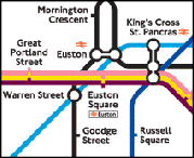
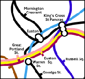
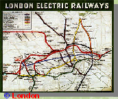
Which style of map would you consider to be more 'user-friendly' ?
Public transport in London:
Market report 2000.
Donwload pdf then click-in and out