 |
|
|
|
|
|
|
|
|
|
|
|
|
|
|
|
|
|
|
|
|
|
|
|
|
|
|
|
|
|
|
|
|
|
|
|
|
|
|
|
|
|
|
|
|
|
|
|
|
|
|
|
|
|
|
|
|
|
|
|
|
|
|
|
|
|
|
|
|
|
|
|
|
|
|
|
|
|
|
|
|
 |
|
 |
|
|
|
|
~ Design & Technology ~
|
|
|
|
|
|
|
|
|
|
|
|
|
|
|
|
|
|
|
|
|
|
 |
|
|
|
|
|
 |
|
|
|
|
|
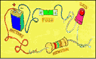
There are two sections to this project, one is understanding a little more about plastics and their uses as well as ways in which we can shape and join them, whilst the other is to gain a better understanding of basic electronics. One part of the project you have been asked to do requires you to collect data from a potential target market. - The target market is really a group that make up a large proportion of the customers for your product. So, how do you find out what people want from a product that you might be thinking of manufacturing ? Easy really ! … You ask them.
|
|
|
|
|
|
|
|
|
|
|
 |
|
|
|
|
|
|
|
 |
|
|
|
|
|
|
|
|
|
|
|
|
The data you collect will eventually need to be presented in a simple graphic form and you probably already know of a few good ways to present data like this. Using graphic ways of presentation makes things much easier to understand.
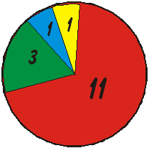
One excellent way of showing the results of such a survey is by using a pie-chart. On this chart there were 16 people whose views were taken on something and this chart easily shows their responses.
|
|
|
|
|
|
|
|
|
|
|
|
|
|
|
|
|
If you had asked the 16 people how much they would pay for a particular item and had given them a choice of £1-2, £3-4, £5-6, £7+, and their answers could have placed them into one of four groupings. Say for instance 1 person answered £1-2, 1 person answered £3-4, 3 people answered £5-6 and 11
people said they would pay over £7 then the data could be shown as seen in this pie chart.
|
|
|
|
|
|
|
|
|
|
|
|
|
If you have never produced a pie chart before then start by drawing the circle and then divide the
360 degrees within the circle into sections. Each section is drawn in proportion to the number of people that are gave one particular answer.
So in this example there are 16 people that make up the whole circle - so each person is represented by 360 /16 = 22.5 degrees. The yellow section representing one person is 22.5 degrees, as is the pale blue section. The red section representing 3 people is 3 x 22.5 and the 11 'red' answer group is 11 x 22.5 degrees.
|
|
|
|
|
|
|
|
|
 |
|
|
|
|
|
One obvious way of simplifying any survey you do would be to ask perhaps 10 or 20 people since this will make the calculation easier !
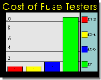
Remember bar charts don't have to be boring. They need to show results of your survey but they can do it in an interesting way.
|
|
|
|
|
|
 |
|
|
|
|
|
|
|
|
|
|
|
|
|
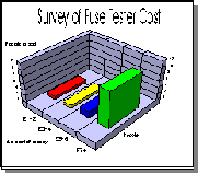
You could make the chart have a 3-D appearance or you could replace the different heights of the bar section of the cart with something more interesting like a pile of coins - since the question related to how much the customer was prepared to pay for the fuse tester.
Now devise the questions you are going to use in your survey.
|
|
|
|
|
|
|
|
|
 |
|
|
|
|
 |
|
|
|
|
 |
|
|
|
|
 |
|
|
|
|
|
|
|
|
|
|
|
|
|
|
|
|
|
|
|
|
|
|
|
|
|
|
|
|
|
|
|